 01
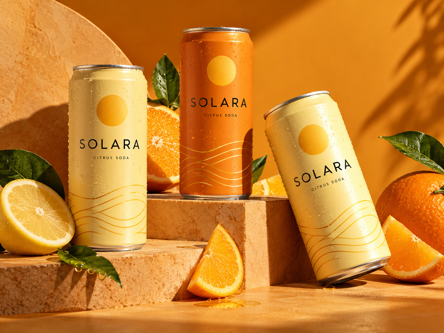
Solara
A brighter kind of refreshment.
Branding / PackagingCONCEPT PROJECT
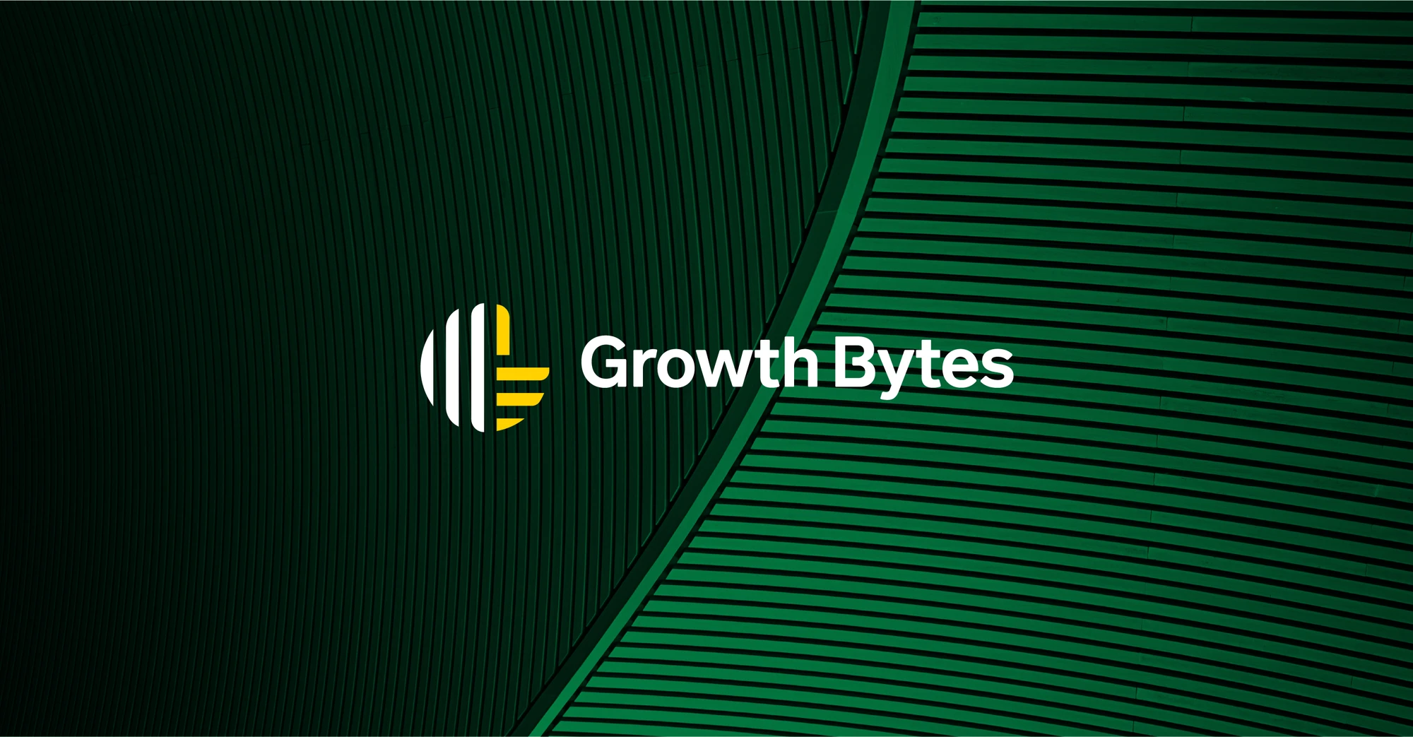
Growth Bytes connects marketing, design and technology. The project gives that approach a recognisable identity, bringing its growth-led outlook into a coordinated visual system.
Express growth, teamwork and digital capability in one distinctive symbol, with a flexible identity for varied brand applications.
The circular mark brings together references to a rising graph and an upward-pointing thumb. Green and yellow shapes suggest the initials G and B, connecting business growth with digital data. The complete circle reflects an integrated approach to digital services.
The identity combines a constructed logo, defined colours, typography and graphic applications. The gallery follows the presentation from visual principles through to branded mockups.


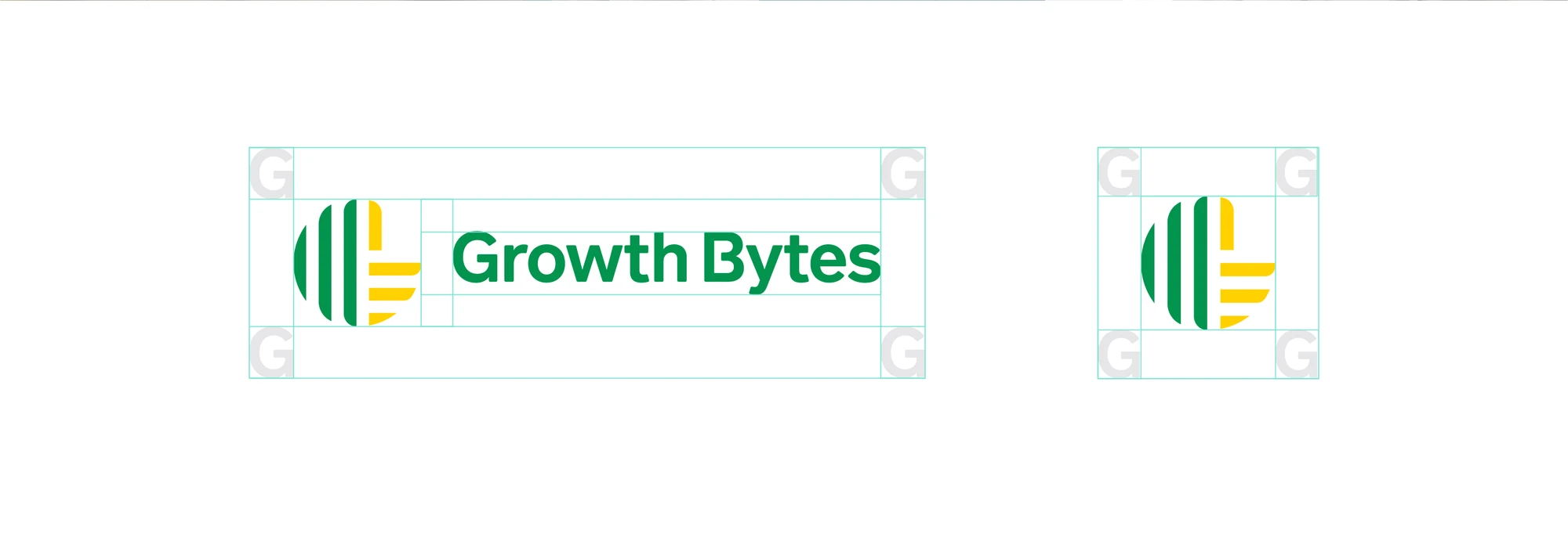
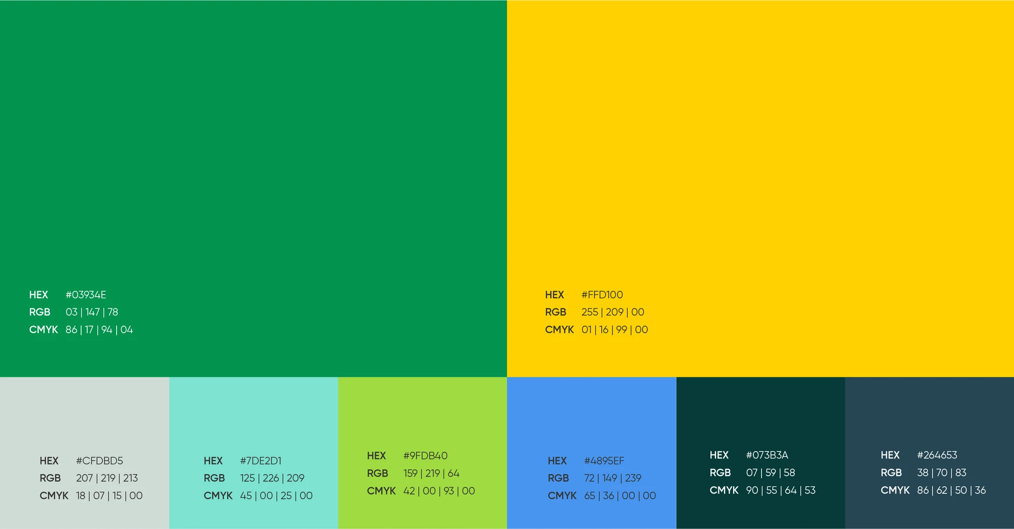
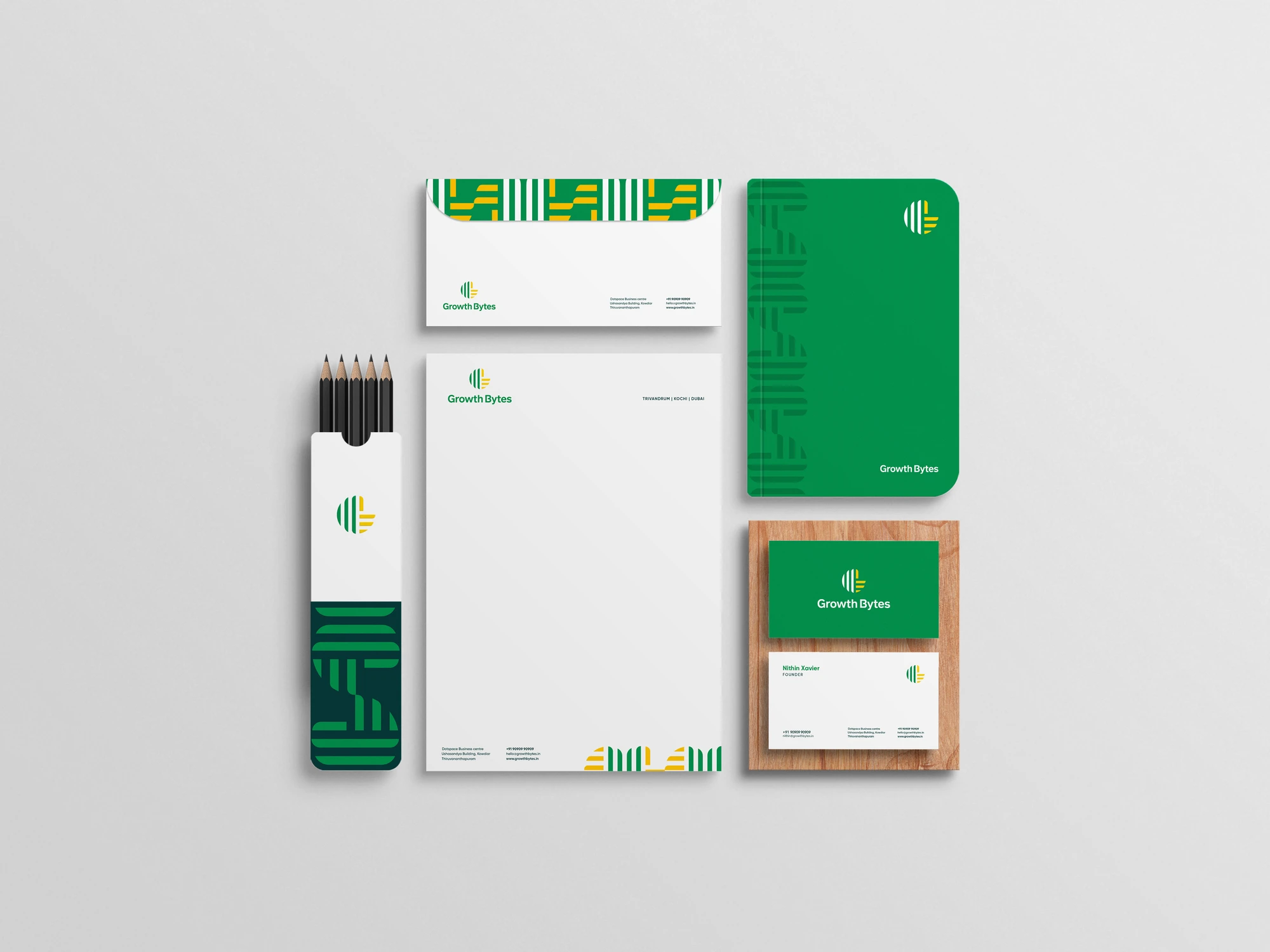
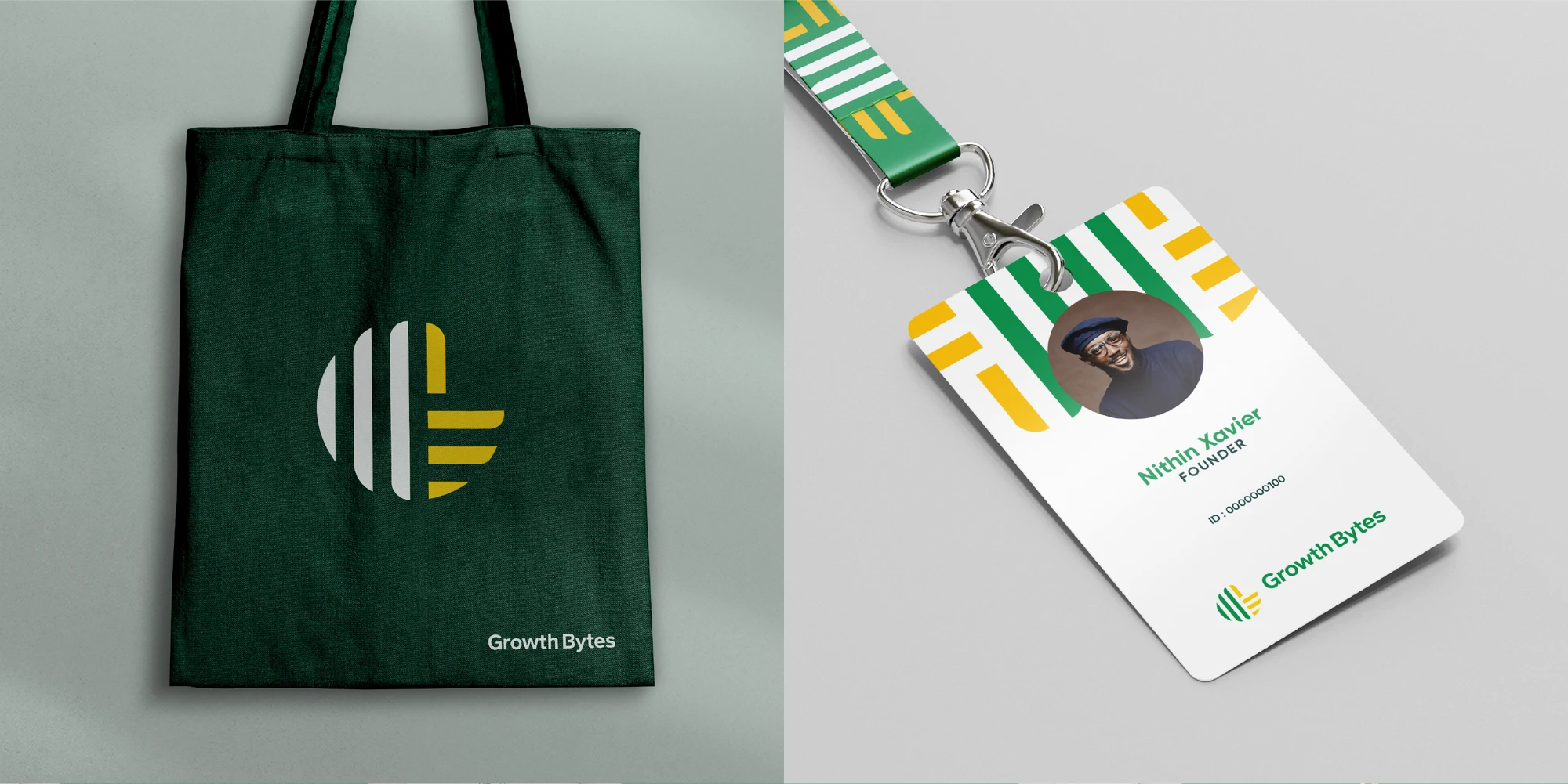
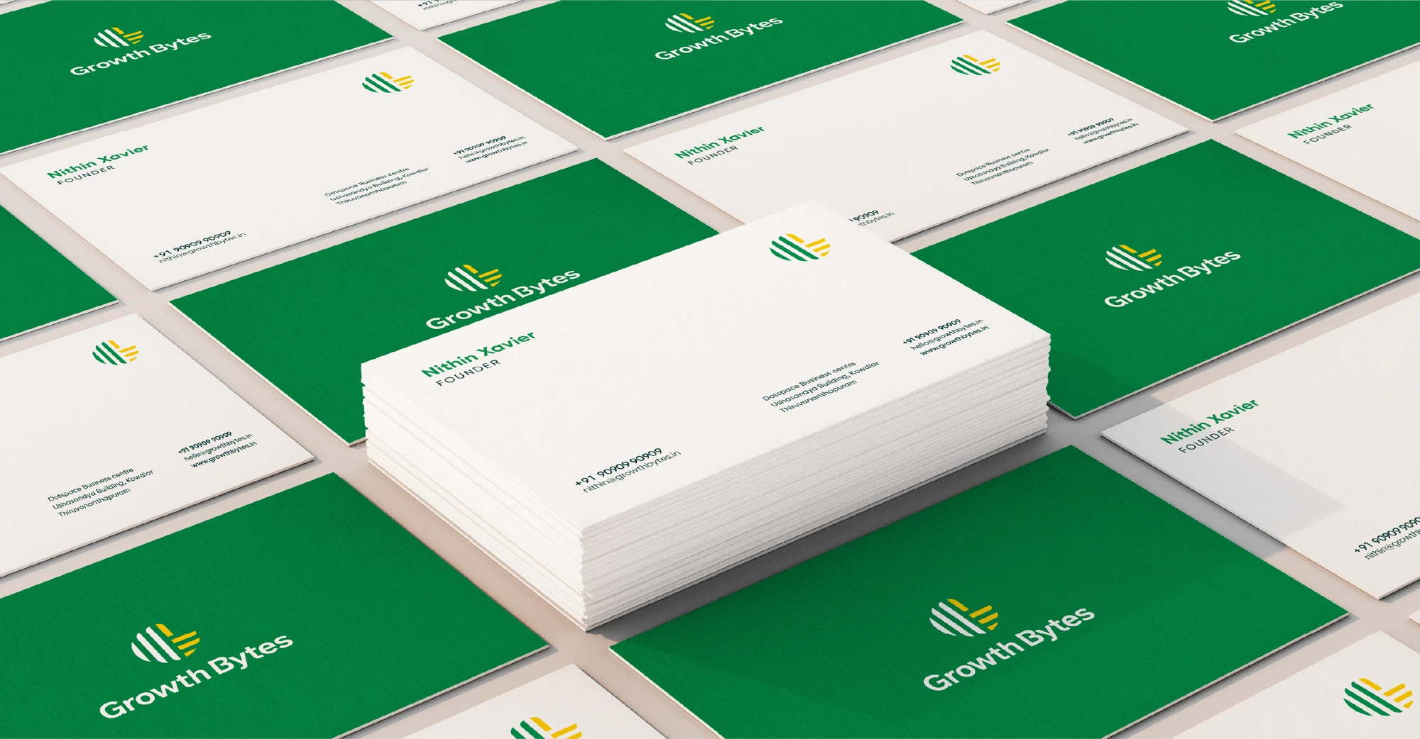
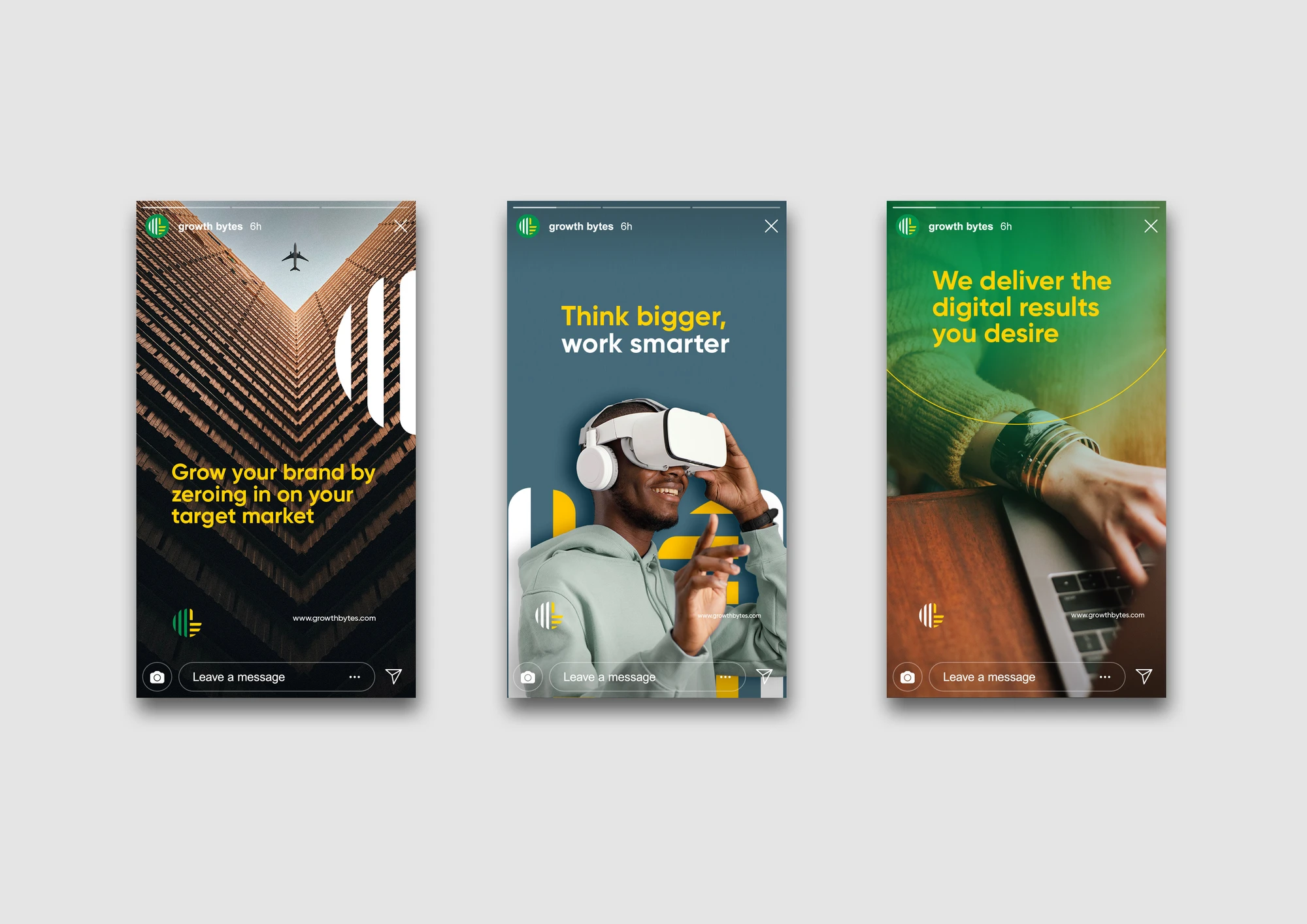

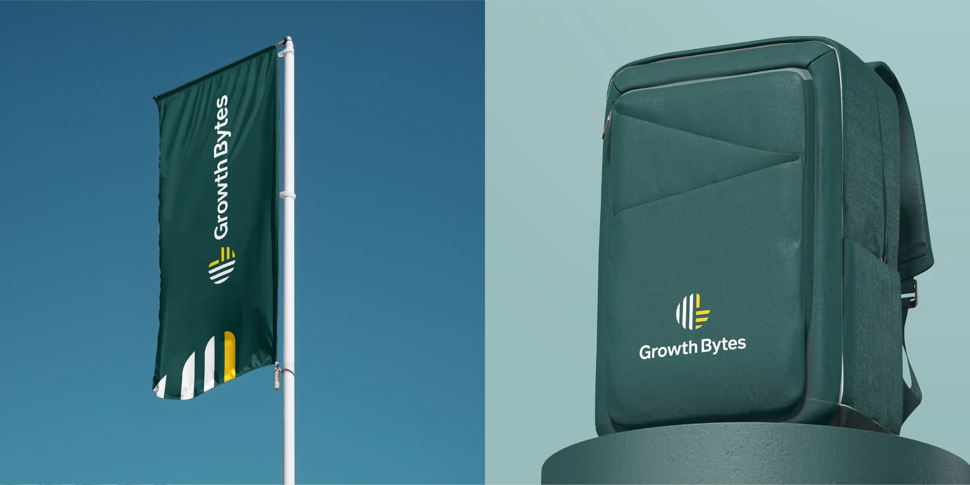
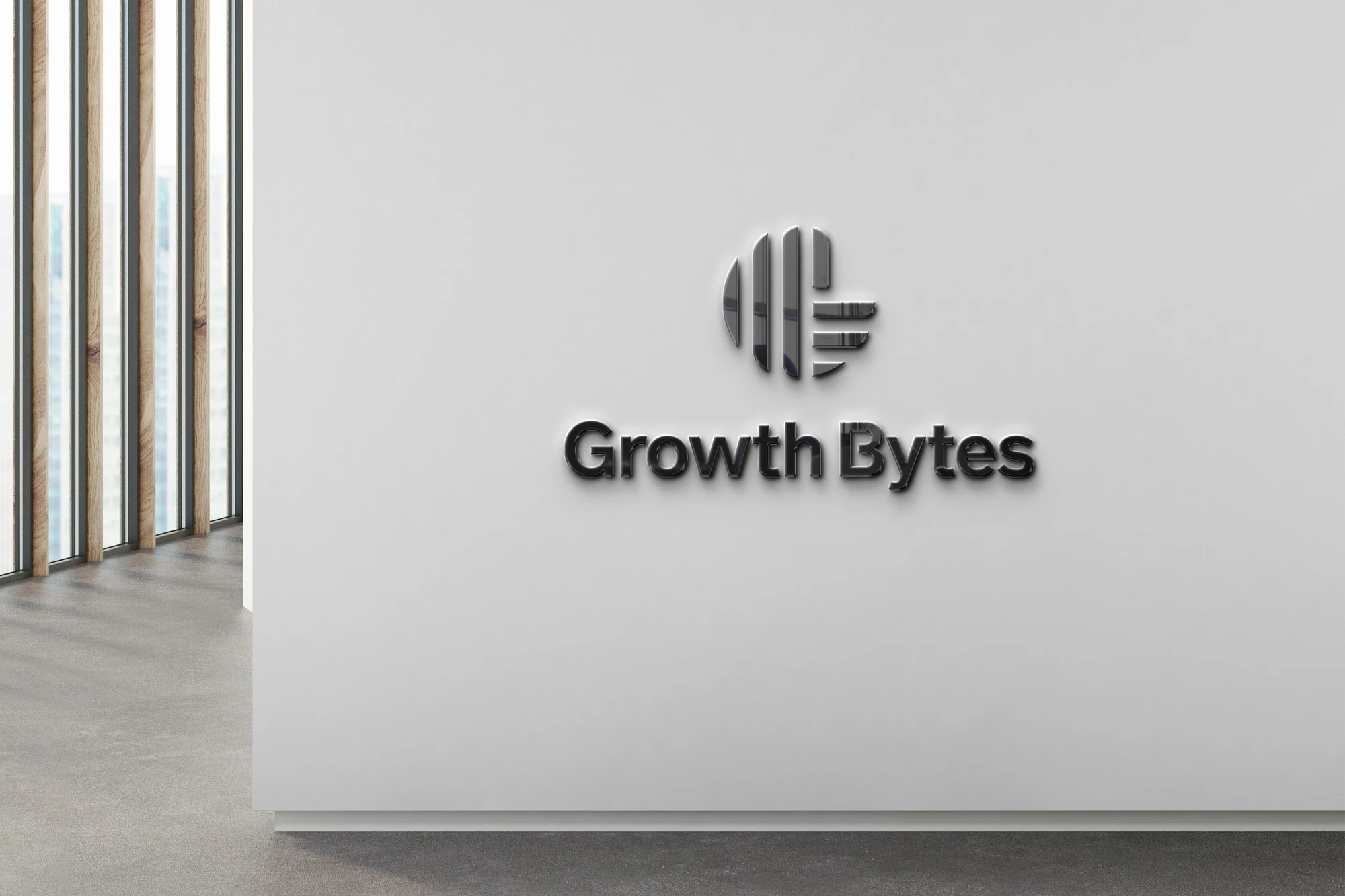
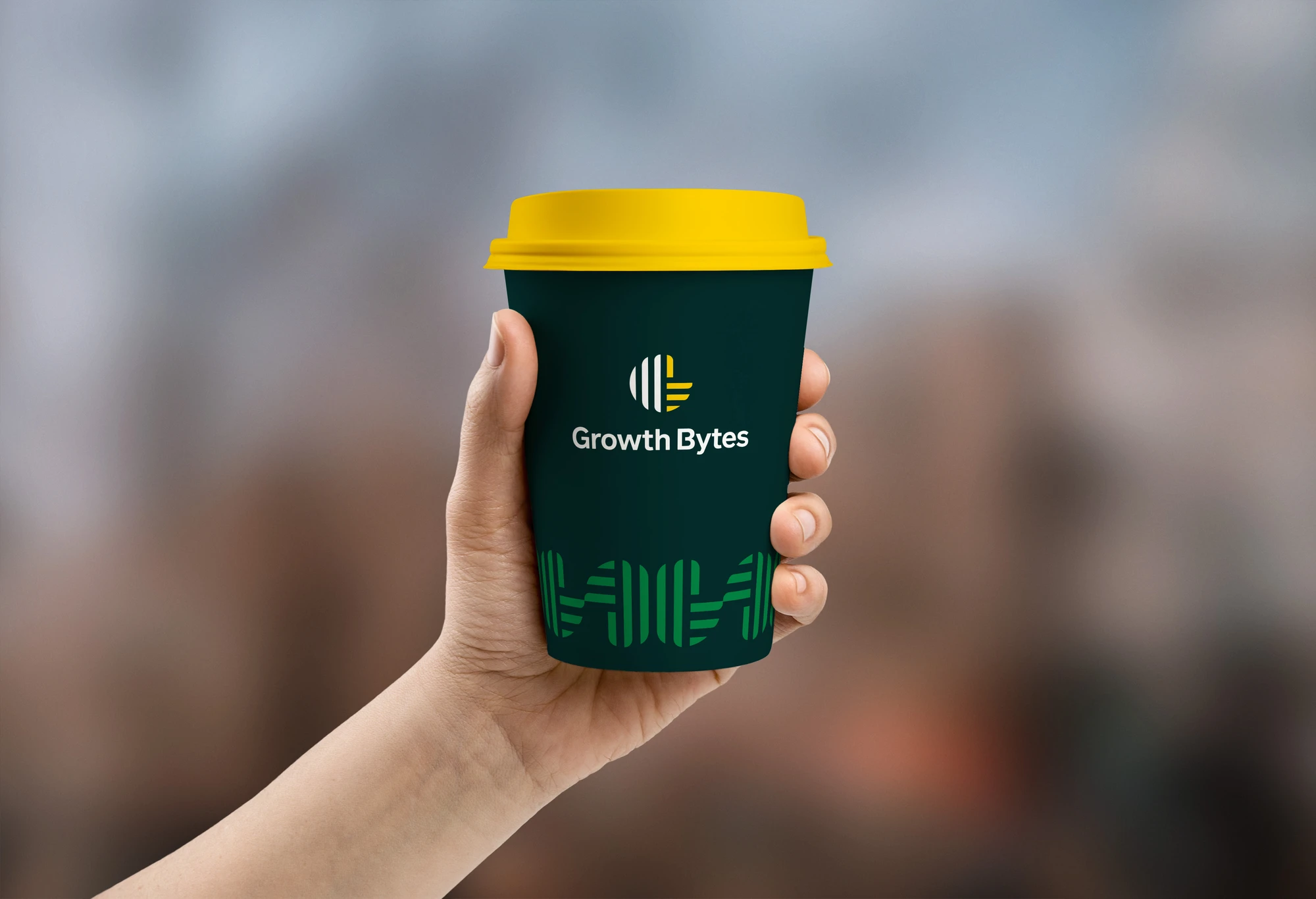
A coordinated identity presentation covering logo construction, colour, typography and branded applications.
Brand identity artwork and design mockups. Originally published on Behance in May 2022.A new brand. A fresh perspective. A brief worth exploring.
Start a project