 01
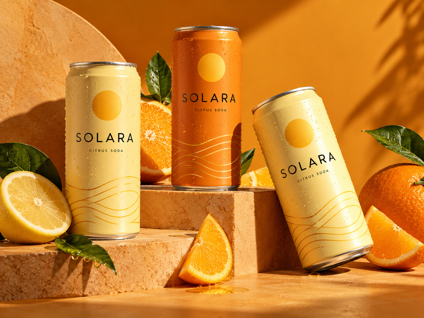
Solara
A brighter kind of refreshment.
Branding / PackagingCONCEPT PROJECT
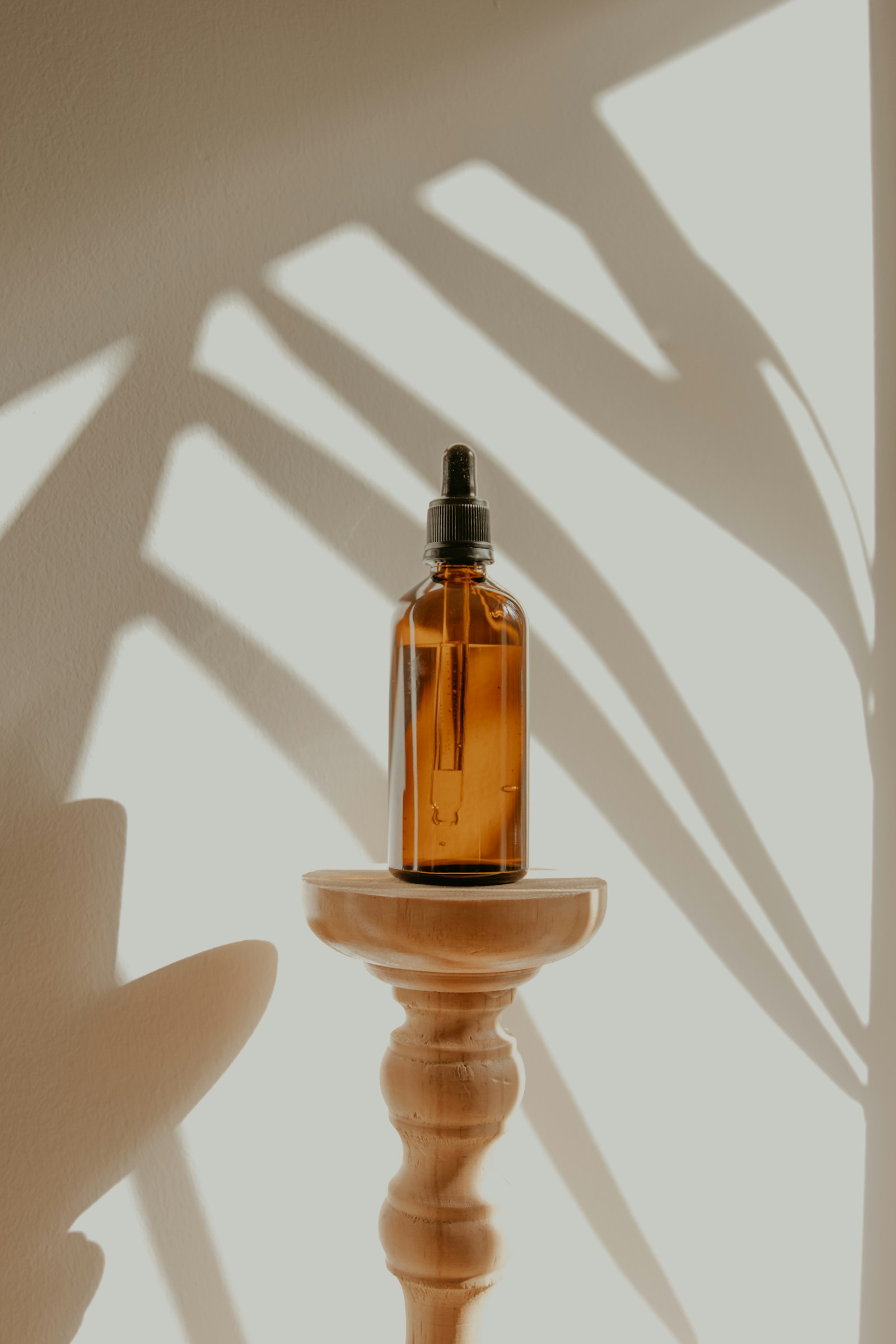
An illustrative study in a calmer visual language for an imagined everyday-care brand. The concept centres on texture, natural light and moments of pause.
Wellness imagery often looks interchangeable. The task was to explore a visual system that feels grounded and recognisable while leaving the product room to breathe.
FORM / COLOUR / FEELINGAttention to the ordinary. Close crops, soft daylight and a restrained palette bring everyday objects into focus. Tactility carries the story where unnecessary decoration would distract.
A proposed art-direction system spanning product stills, editorial compositions and simple packaging applications. Reference photography is used here to demonstrate the intended mood; it is not presented as commissioned agency work.
No verified performance results have been added for this project.
Illustrative concept with reference stock photography. No client work or measured results are claimed.A new brand. A fresh perspective. A brief worth exploring.
Start a project